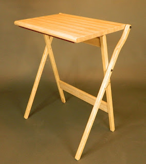
There is a dated X frame wood TV tray table design out there, available many places. I have one, bought from my local Target store. Trying it out I was appalled at how poor the ergonomics of it are. This disappointment spurred my creative genes to design a simple version that solves every complaint I have with the original. In my iterative sketching process I stumbled upon a geometry that allows the design to be turned inside out to serve in two useful positions.
 |
| Slanted Top |
In one position the top is slanted with a stop lip on the front edge. Musician? A place for your manuscript paper when jotting down a tune. Have a tablet? A better eyeline to see it when using it. A good place for note or sketch pad, and your pen/pencil can park on the protruding ledge.
Turn the table inside out (flip the top and pull the leg frame through) and the top ends up horizontal for your lunch tray or laptop or solitaire card game.
 |
| Horizontal Top |
 |
| Side by Side |
My design uses a simple tension cable uniquely routed to lock the geometry in both positions. This option is between the front and back legs. A tension strap could instead be attached to the back edge of the top and the top stretcher. Shown here in another prototype of mine:
 |
| One inch straps |
 |
| Two Inches Thick |
You can pick up the table to move it by simply reaching under the center of the sides and holding the legs against the top as you pick it up. Or by picking it up from the center of the top stretcher.
The wood top could have an added value inlay to appeal to specific audiences. Team logos, family crests, sports icons, company brands/logos, etc.. Something unique on each side perhaps. Customize it for each client for an added fee.
It can also vary in finished detail. One may have bullnosed front and back edges like the example above. Another might have the front corners radiused with a squared edge wrapping from side to front to other side. The back edge still rounded over as shown below.
 |
| Red Oak Top Alternative |
 |
| Rear Corner Detail |
The stop ledge can be made from a matching wood or contrasting wood to emphasize it's presence. It could even be a strip of aluminum or brass or something more exotic. Bronze or black oxide or chrome or powder coated bolts in just about any color are options to consider. There are also hardware options out there for how to connect the legs and table top.
This design is patented. For information about licensing the design please contact:
Sarah NoltingLicensing Associate
Kansas State University Innovation Partners
(785) 532-3910
snolting@ksu.edu
www.k-state.edu/innovation-partners


No comments:
Post a Comment